Under the cover
Behind-the-scenes details of my cover illustration, article, and more for Santa Barbara Magazine’s Home and Garden Issue
What a thrill it was to be tapped to illustrate the cover for Santa Barbara Magazine’s Home and Garden special issue — first in a series of four throughout the year to celebrate the publication’s 50th Anniversary. I spent a decade working in architecture and urban design early in my career, so when the magazine’s Executive Editor, Gina Tolleson, asked me to contribute illustrations based on local historic buildings and pen an article about my bungalow, I felt that she’d read my mind (and perhaps also my resume.)
The Cover
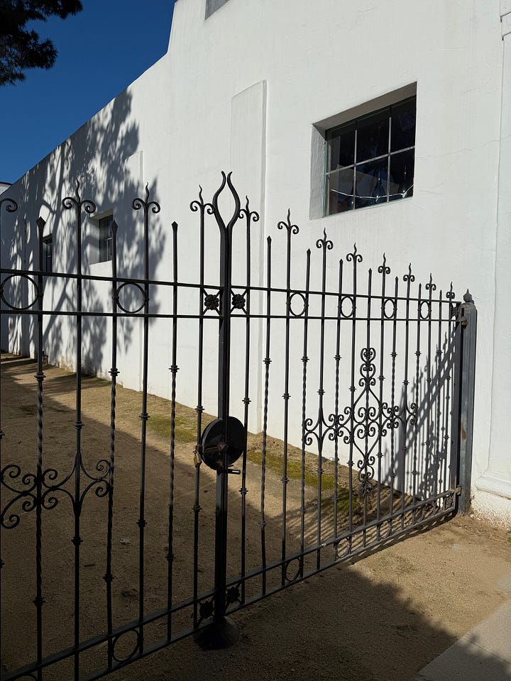
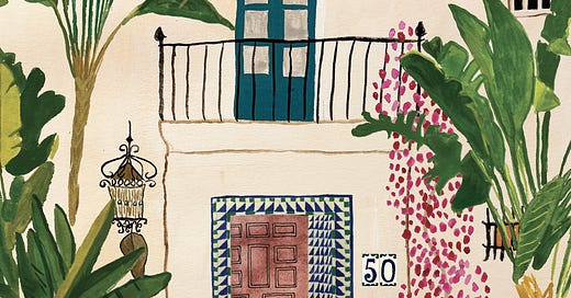
Gina’s design brief was wide open: “paint your idea of a fantasy Santa Barbara house, Olivia.” My mind jumped to adobe paired with all the architectural details one associates with Santa Barbara – Spanish tile, ironwork, balconies, Saltillo floors, lovely antique lanterns – and a garden that would spill into the frame. I got cracking studying a few of my favorite George Washington Smith houses in Santa Barbara and Montecito (he designed nearly 80 structures in the span of his career before he died in 1930.) I love Smith’s symmetry, his asymmetry, his flair for a dramatic front door, and the way his buildings often maintain one foot in Andalusia. His houses pay attention to tile and iron work in a way that appeals to my fantasy of Santa Barbara as much as its reality. It felt right that one of his buildings should be center stage, on the cover of a magazine. They are sultry and opaque - few windows on the facade made you pine to know what’s inside. My little art studio is housed within a building of his – Meridian Studios -- and while it’s more of a 1920s movie studio complex, the space is also imbued with a certain theatricality.


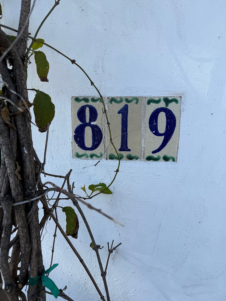
I enthusiastically began by painting two huge banana leaf palms. I love when they dwarf a building. I’ve also been told that banana leaf palms bring good luck. The legendary late founder of Raoul Textiles, Sally McQuillan, planted them outside her production facility off State Street to bring good fortune to her business. (You can read about Sally in my friend Lorie Porter’s beautiful piece here in the same issue.) Next, I painted a classic Smith house with a single balcony above a deeply set front door. I made sure to iterate a railing with a little Spanish panache, but not so much flourish that it felt cartoony. What I sought was for the eye to be drawn to the tile around the door. The tile took a while to paint and get the perspective right, but just off enough to not feel like a hollow copy of a photo. I love how it feels to be inside a tile vestibule – almost as though you are sitting inside a fountain at The Alhambra, with your voice bouncing off the ceramic’s echo chamber. Gina had the great idea for the house numbers to nod to the 50th anniversary of the magazine, which I painted as if they were tiles.
Bungalow Fever
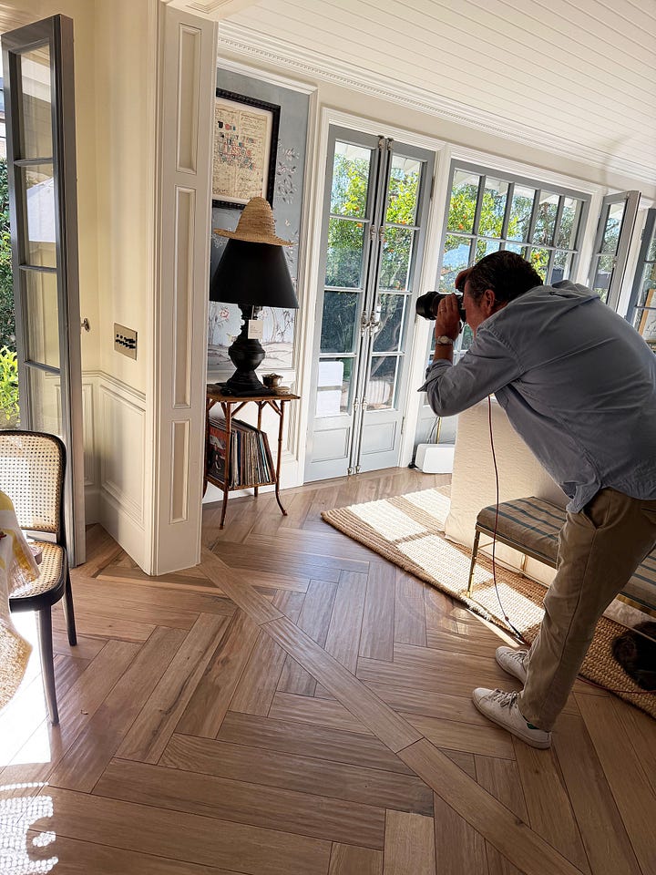
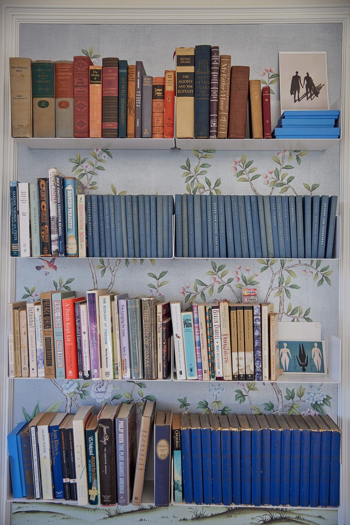
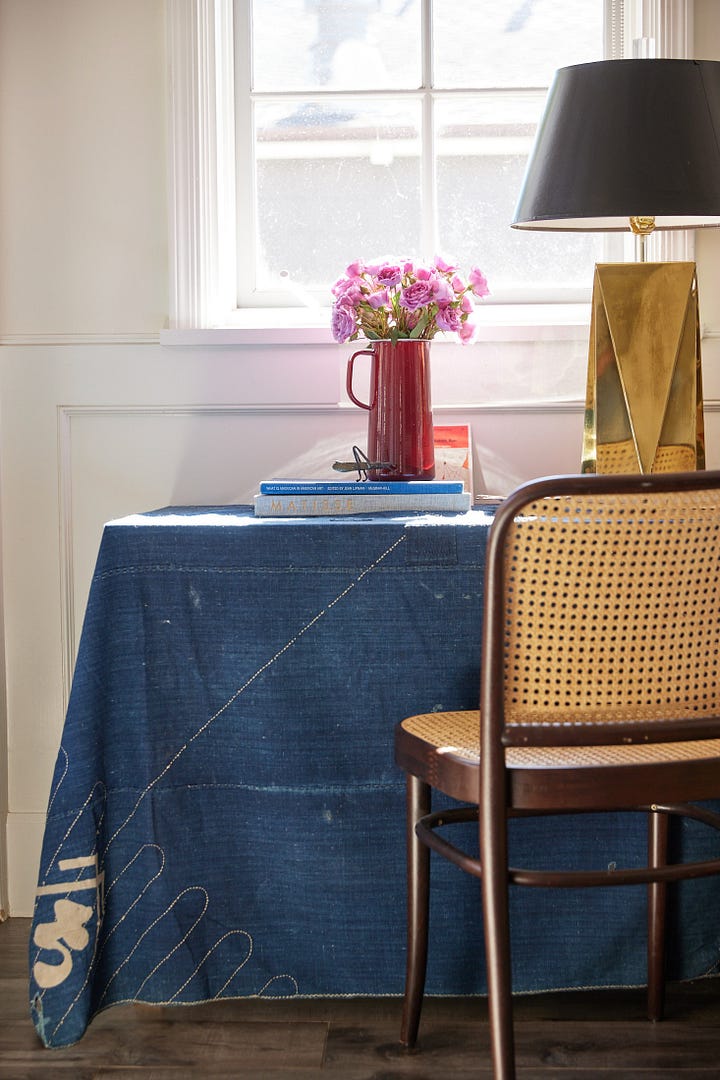
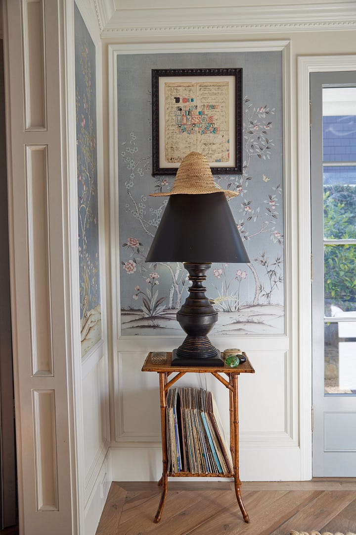
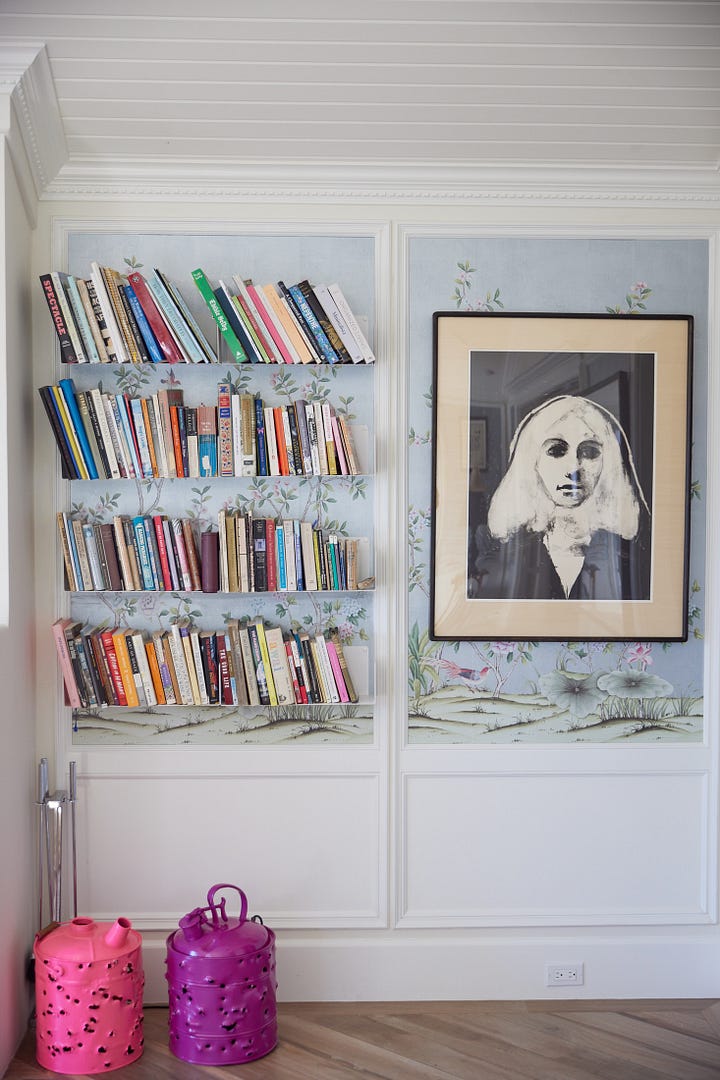
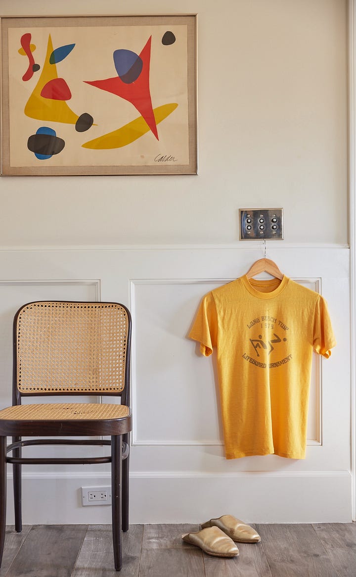
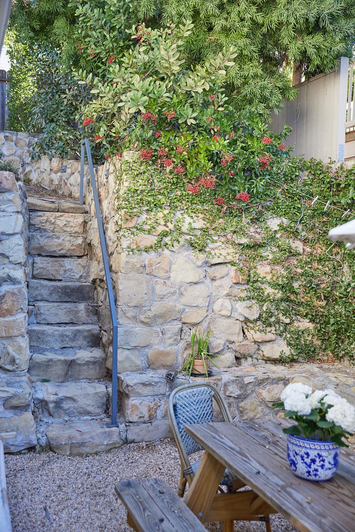
In addition to the cover, Gina asked if I’d be open to writing about my own house, a bungalow. I had already explored my strange allegiance with bungalows and their ethos. But the opportunity to write a first-person account of my bungalow and why I find them such compelling little structures, I was pretty much in heaven. We approached Matt Albiani, one of my favorite photographers to come shoot for the story. We’d worked together once back in the days of my caftan line, and in 2020 his fabulous shop, Mate Gallery ( co-owned with Matt’s husband Ron Brand) became the first shop to carry my watercolor Prose Orbs. Matt is an East Coast version of a Beachtown Bohemian, to whom I feel a certain kinship: I love a wool sweater on the beach and a dogeared J.D. Salinger because my parents were that way. I felt easy about my house being seen through his lens. The sun came out for a bit the day that Matt came to take the following pictures, which can be seen in the article, which is called Be Like the Bungalow.





Lettering a Mood, Mapping sans Scale
The art director asked me to letter an arsenal of phrases that are now scattered elegantly throughout the magazine – pretty cover lines, hashtags, numbers 1-50, as well as spot illustrations of agave, flora, and trees. Tucked inside the issue, there is also a map of some of the types of bungalows to be found in Santa Barbara – I learned it’s called a well opener which in publishing means an open-faced sandwich-esque, double-page spread with lots of real estate to add detail. All the houses depicted on the map are ones I pass on my walks around downtown Santa Barbara. For weeks I’d snap pictures of bungalows and print them for my cork board back at the studio. You might be surprised to know that the well illustration took about 3 times longer to create than the cover, strangely. Illustration is funny that way: sometimes things coalesce quickly. And sometimes you hit the sweet spot on edit number fifteen.

A meditation on place
The most serendipitous part of the Santa Barbara Magazine project was that it shaped my work life for two months around a topic that is deeply meaningful to me: being rooted in and belonging to a place. I have issues with modernity. I don’t love the placelessness of the internet. I prefer the real world, and in particular, the town in which I live. (Beachtown Bohemia, for example, is just such a celebration of the physical world, coastal California, and it’s IRL culture.) I find Santa Barbara endlessly compelling. I don’t tire of looking at Santa Barbara, smelling it (eucalyptus, seaspray), listening to the Mission bells when they toll at 6:00 am or the surf on a stormy day or a truck driving past blasting mariachi music. It’s a little like being lovesick to be crazy about your home but not be afforded time off the computer to savor it. This project presented me with a built-in meditation on place — on home— the pretty byproduct of which I can hold in my hand.
I feel very lucky.
Special thanks
Thank you to the whole team at Santa Barbara Magazine : Jennifer, Charlotte, Sarah, James. In particular, a thank you to Gina Tolleson who is one part poetic southern belle, one part Thelma & Louise-esque fierce female energy, and one part sorceress who knows how to conjure the best work out of someone.
Beachtown Bohemia is paywall free. You can support me by liking this post (heart button at the top) and sharing it with anyone you feel would appreciate it.




I love this behind-the-scenes so much! And I definitely need to get myself a copy of the magazine.
Thank you so much! It sounds like we are involved in the same vein of place-centered storytelling. It’s soulful work. (No pun intended — I was in Seoul two summers ago and was pretty blown away.)